Consumer AI Tool for Personalized Micro-learning
product design
internship
befreed
BeFreed is an AI-powered learning platform that allows people to learn anything, personalized. Backed by Afore Capital & ElevenLabs.
We live in a world of constant information abundance, and having easy access to such knowledge is a blessing, but the sheer volume of content has emerged a new challenge: cognitive overload.
Long-form reading is increasingly competing with algorithmic feeds and AI summaries. While summarization tools make information faster to consume, they often flatten nuance and reduce comprehension.
This is exactly why BeFreed was created. BeFreed is an AI-powered reading platform designed to help users navigate complex ideas more efficiently.
01 CONTEXT
A startup preparing to raise, with retention it couldn't explain
BeFreed is an AI-powered reading platform. The idea is good: consume books faster but still retain all the knowledge. When I joined, users were coming in, trying it once, and leaving.
The founding team had correctly diagnosed symptoms:
high early drop-off
low engagement
weak repeat use
My challenge:
make the reading experience better
make onboarding clearer
make the product detail page convert.
02 WHAT I NOTICED
The drop-off was confusion about what to expect.
The original analytics story was: users open the app, start a summary, don't finish it, and leave. The obvious fix is to make summaries more engaging.
When I looked at where in the flow drop-off happened, it wasn't mid-summary. It was earlier, on the product detail page, or right at the start of reading. Users weren't losing interest, rather they were having trouble deciding.
That suggested a different problem: not engagement, but expectation mismatch. Users arrived with one mental model of what the product was, encountered something different, and left. Not because the product was bad, because they didn't know how to hold it.
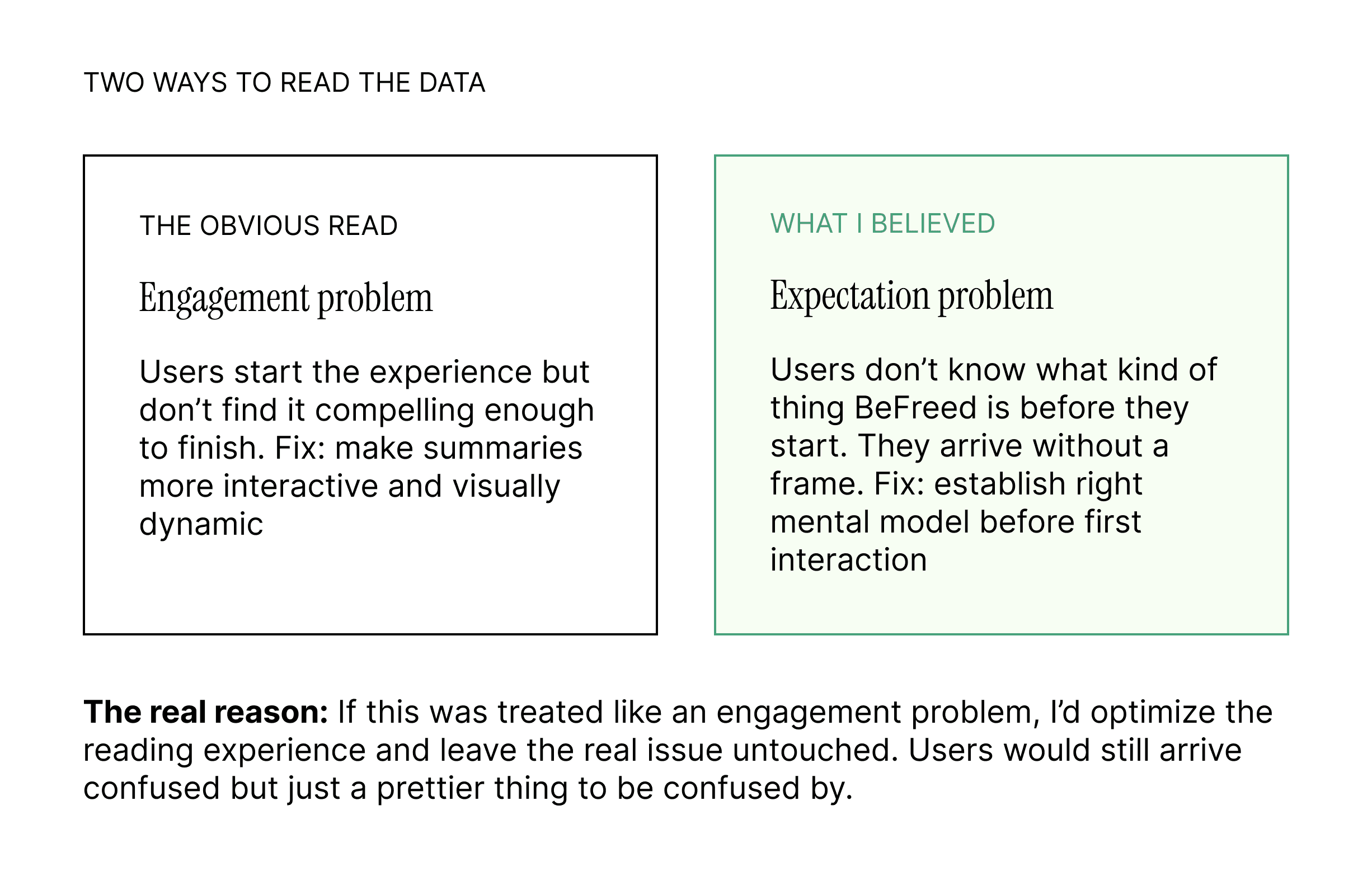
This reframe shaped almost every decision I made after it.
03 FEATURES
PRODUCT DETAIL PAGE
The PDP wasn't a conversion problem, but a trust problem.
The original PDP showed a book cover, a title, a description, and a "choose your reading style" option. What do those reading styles mean? The user is now confused and unsure what to pick.
Without answers, users were making conservative decisions. They'd hesitate, browse away, and not come back.
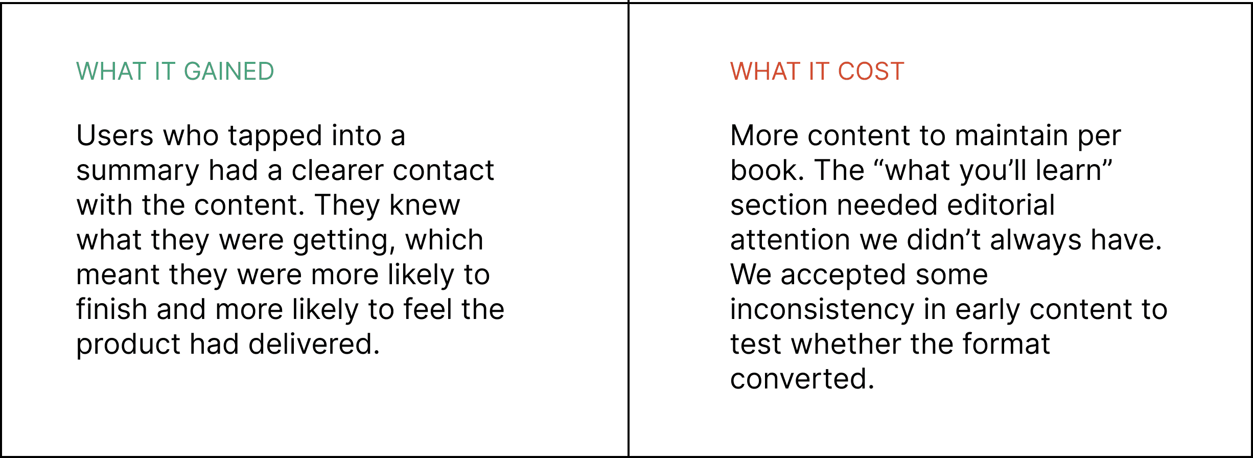
The redesigned PDP answered all the questions before asking anything of the user: a short "what you'll learn" section, a read time, a topic preview, and a visual peek at the card format. The goal wasn't to sell the book, it was to remove uncertainty.
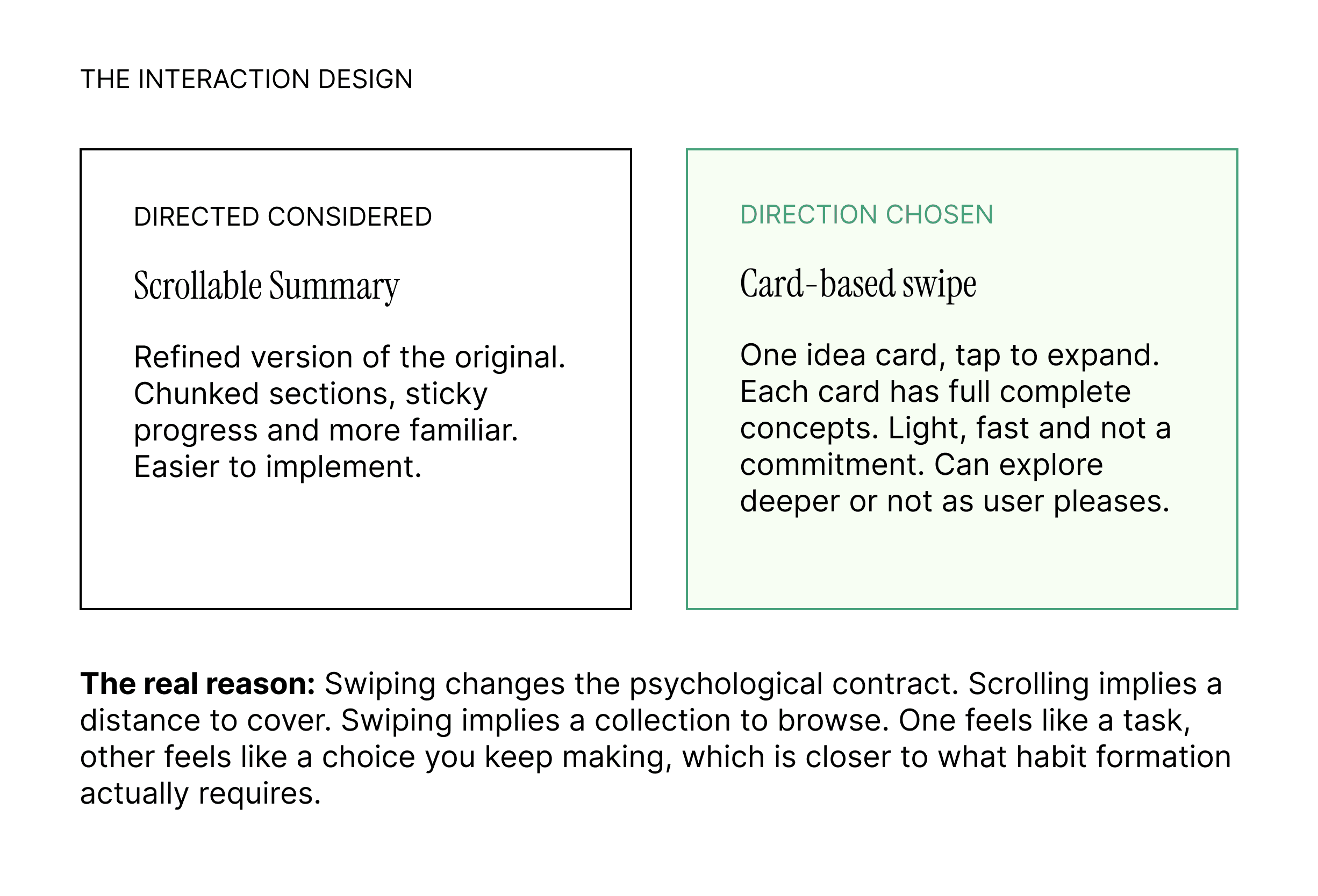
SWIPE SUMMARY EXPERIENCE
The swipe pattern was a way to reduce friction and time needed.
The original reading experience was a long scrollable page. Paragraphs, headers, a reading progress bar, which was fine, but I wanted to offer another way for readers to choose how they wanted to learn.
BeFreed's value proposition is that you don't have to read the whole book, but even the shorted story looked like a lot of effort, like homework. It created cognitive overhead before a single word was absorbed.
"I wasn't designing a better reading experience. I was designing an experience that didn't feel like reading at all."
What I was worried about
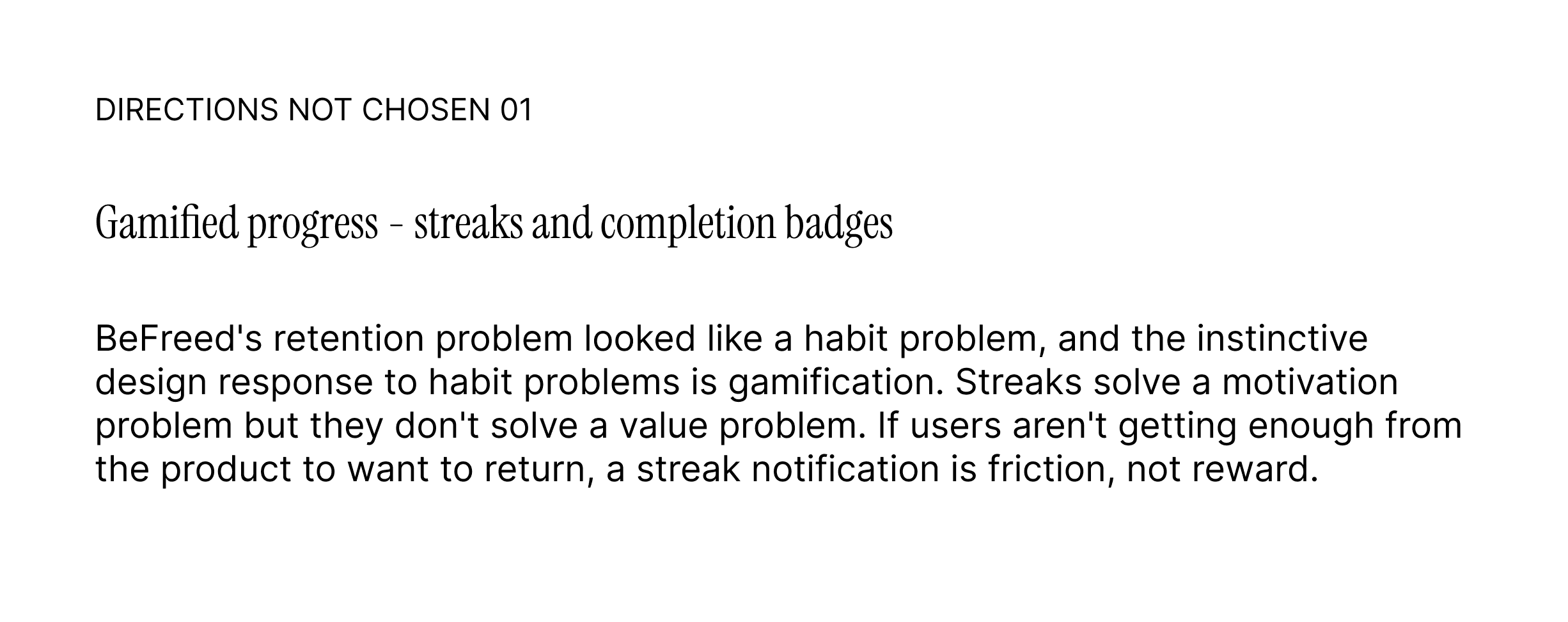
The obvious pushback against notes is that they fragment knowledge. A book's ideas have relationships, and slicing them into atomic units risks making content feel shallow. However, a wall of scrollable text nobody finished — wasn't creating depth either. A shallow experience someone completes is more valuable than a rich experience someone abandons.
The card content itself needed to be written carefully: each card had to stand alone but also create a pull toward the next one.
MIND MAP FEATURE
Discovery was broken because the book categories didn't speak in ideas, it spoke in titles.
The home screen showed a library of book covers, and that's how every reading app works. However, BeFreed is not a traditional reading app, it's an idea-consumption app.
Someone interested in understanding why habits are hard to change doesn't necessarily think "I want to read an Atomic Habits summary." They think about the underlying question. BeFreed's content was indexed wrong for the way users were actually thinking.
The mind map feature let users navigate by idea cluster rather than by title. Tap a topic node and see what ideas live there, across multiple books. It reframes the library around concepts rather than objects.
This was also the feature with the most implementation risk. It required a taxonomy of ideas that didn't exist yet, and mapping books to that taxonomy manually. It also required lots of engineering power. I framed the first version as an editorial experiment, a fixed set of six clusters, rather than a dynamic generated graph to make it shippable within the short time frame.
04 WHAT WASN'T BUILT
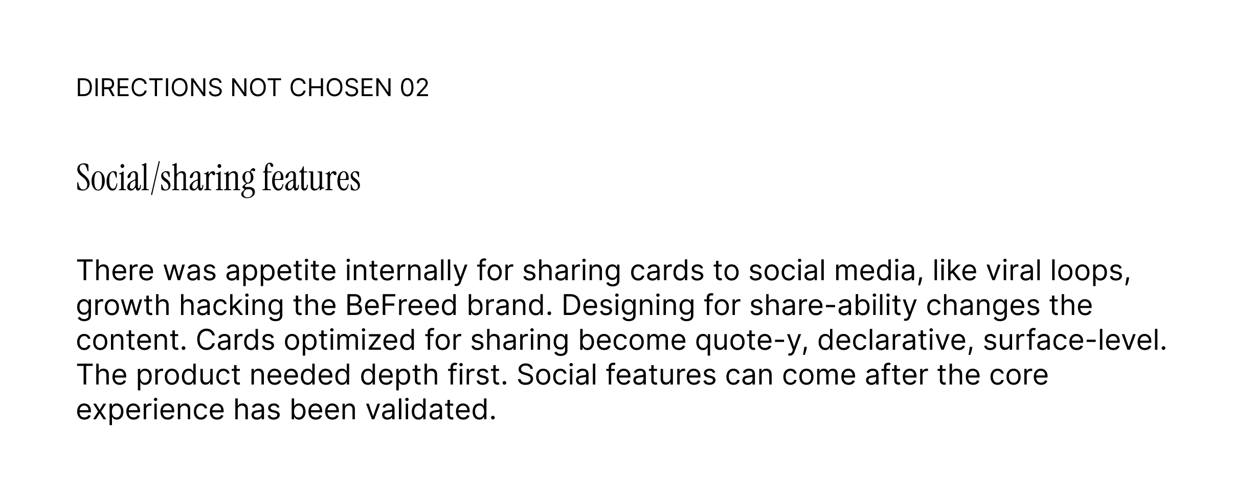
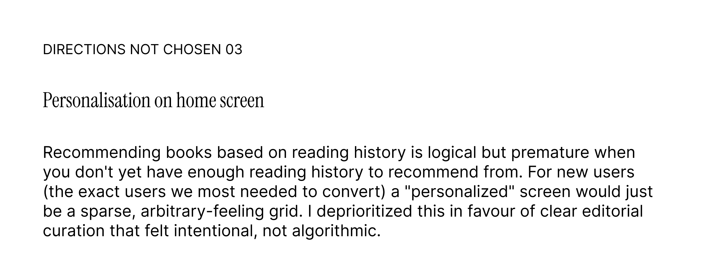
05 IMPACT
What changed, and what it meant for the business
The redesign shipped across a 10-week sprint. The following were the headline movements in product metrics:
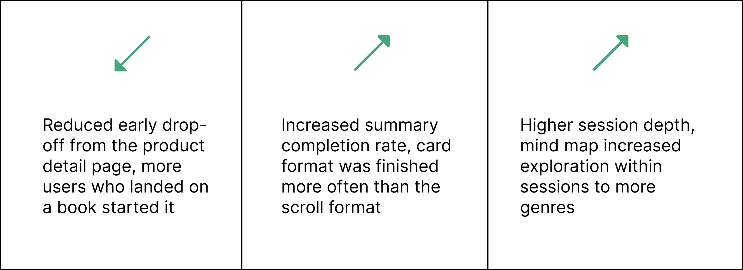
The more significant outcome was qualitative: the product had a clearer identity. Internally, the team could describe what BeFreed was with more confidence. That clarity, which is a design outcome, not just a metric one mattered at a stage where the company was preparing to raise.
"Investors don't just fund metrics. They fund conviction. The redesign gave the team a sharper story about what they were building."
06 REFLECTION
Thinking in systems
I learned to look beyond individual screens and consider how each decision fits into the larger product, including user expectations, existing flows, and overall mental models. Good design came from making the whole experience feel coherent, not just improving one part.
Designing for ambiguity
Working in an early product meant many things were undefined. I learned that interface design alone isn’t enough, clarity often depends just as much on content, structure, and information hierarchy. Content design and UI design need to be solved together.
Balance solving user needs with business needs
Design decisions were closely tied to product goals like engagement and retention. This experience strengthened my ability to balance usability with business constraints, and to make choices that supported both the user experience and the product’s growth.
01 CONTEXT
A startup preparing to raise, with retention it couldn't explain
BeFreed is an AI-powered reading platform. The idea is good: consume books faster but still retain all the knowledge. When I joined, users were coming in, trying it once, and leaving.
The founding team had correctly diagnosed symptoms:
high early drop-off
low engagement
weak repeat use
My challenge:
make the reading experience better
make onboarding clearer
make the product detail page convert.
02 WHAT I NOTICED
The drop-off was confusion about what to expect.
The original analytics story was: users open the app, start a summary, don't finish it, and leave. The obvious fix is to make summaries more engaging.
When I looked at where in the flow drop-off happened, it wasn't mid-summary. It was earlier, on the product detail page, or right at the start of reading. Users weren't losing interest, rather they were having trouble deciding.
That suggested a different problem: not engagement, but expectation mismatch. Users arrived with one mental model of what the product was, encountered something different, and left. Not because the product was bad, because they didn't know how to hold it.
This reframe shaped almost every decision I made after it.
03 FEATURES
PRODUCT DETAIL PAGE
The PDP wasn't a conversion problem, but a trust problem.
The original PDP showed a book cover, a title, a description, and a "choose your reading style" option. What do those reading styles mean? The user is now confused and unsure what to pick.
Without answers, users were making conservative decisions. They'd hesitate, browse away, and not come back.
The redesigned PDP answered all the questions before asking anything of the user: a short "what you'll learn" section, a read time, a topic preview, and a visual peek at the card format. The goal wasn't to sell the book, it was to remove uncertainty.
SWIPE SUMMARY EXPERIENCE
The swipe pattern was a way to reduce friction and time needed.
The original reading experience was a long scrollable page. Paragraphs, headers, a reading progress bar, which was fine, but I wanted to offer another way for readers to choose how they wanted to learn.
BeFreed's value proposition is that you don't have to read the whole book, but even the shorted story looked like a lot of effort, like homework. It created cognitive overhead before a single word was absorbed.
"I wasn't designing a better reading experience. I was designing an experience that didn't feel like reading at all."
What I was worried about
The obvious pushback against notes is that they fragment knowledge. A book's ideas have relationships, and slicing them into atomic units risks making content feel shallow. However, a wall of scrollable text nobody finished — wasn't creating depth either. A shallow experience someone completes is more valuable than a rich experience someone abandons.
The card content itself needed to be written carefully: each card had to stand alone but also create a pull toward the next one.
MIND MAP FEATURE
Discovery was broken because the book categories didn't speak in ideas, it spoke in titles.
The home screen showed a library of book covers, and that's how every reading app works. However, BeFreed is not a traditional reading app, it's an idea-consumption app.
Someone interested in understanding why habits are hard to change doesn't necessarily think "I want to read an Atomic Habits summary." They think about the underlying question. BeFreed's content was indexed wrong for the way users were actually thinking.
The mind map feature let users navigate by idea cluster rather than by title. Tap a topic node and see what ideas live there, across multiple books. It reframes the library around concepts rather than objects.
This was also the feature with the most implementation risk. It required a taxonomy of ideas that didn't exist yet, and mapping books to that taxonomy manually. It also required lots of engineering power. I framed the first version as an editorial experiment, a fixed set of six clusters, rather than a dynamic generated graph to make it shippable within the short time frame.
04 WHAT WASN'T BUILT
05 IMPACT
What changed, and what it meant for the business
The redesign shipped across a 10-week sprint. The following were the headline movements in product metrics:
The more significant outcome was qualitative: the product had a clearer identity. Internally, the team could describe what BeFreed was with more confidence. That clarity, which is a design outcome, not just a metric one mattered at a stage where the company was preparing to raise.
"Investors don't just fund metrics. They fund conviction. The redesign gave the team a sharper story about what they were building."
06 REFLECTION
Thinking in systems
I learned to look beyond individual screens and consider how each decision fits into the larger product, including user expectations, existing flows, and overall mental models. Good design came from making the whole experience feel coherent, not just improving one part.
Designing for ambiguity
Working in an early product meant many things were undefined. I learned that interface design alone isn’t enough, clarity often depends just as much on content, structure, and information hierarchy. Content design and UI design need to be solved together.
Balance solving user needs with business needs
Design decisions were closely tied to product goals like engagement and retention. This experience strengthened my ability to balance usability with business constraints, and to make choices that supported both the user experience and the product’s growth.